Fēnix Energy are an industry leading asset investing and consulting service based in Burnaby, British Columbia.
Fēnix had a logo but needed some help to expand on this and develop a foundation of a brand indentity, to bring consistency to their brand with a contemporary and professional vision for their future.
Client
Fēnix Energy
Deliverables
Brand Identity
Graphic Design
Website Design
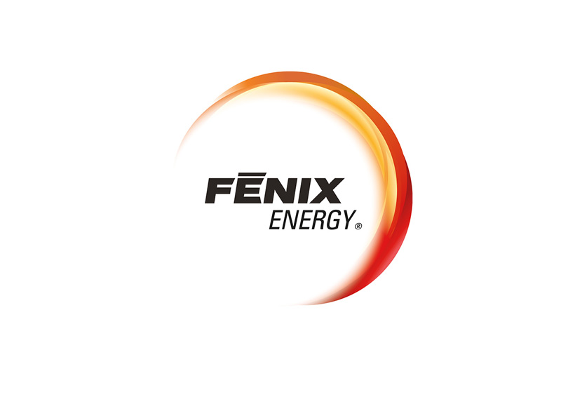
Old logo
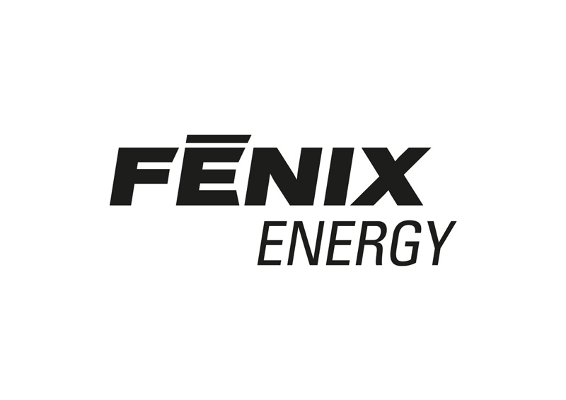
New logo
Refresh of an established logo
We agreed to remove the “halo” gradient effect from the logo as it was awkward when applying the logo to different designs and layouts. We felt the wordmark alone was more bold and modern.
Attention to detail
We noticed the word “Energy” had a different italic amount than the word “Fenix” and it just looked slightly off. We changed this to match the word “Fenix” by adjusting it from 13 degrees down slightly to 9.
A subtle adjustment
With this fix, and the halo removed, the logo is bold and easy to scale. It was also ready to add sub brand wording and colours to it such as for “Fenix Water”, below.
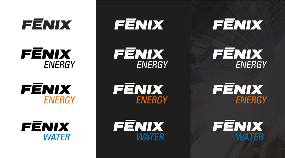
Brand Guidelines
With the logo refined, it was very important to define a brand design system for Fenix and create a brand guidelines document. This one is very in depth defining corporate colours, typography and even how charts, graphs, tables and photography should look in future proposals and presentations.
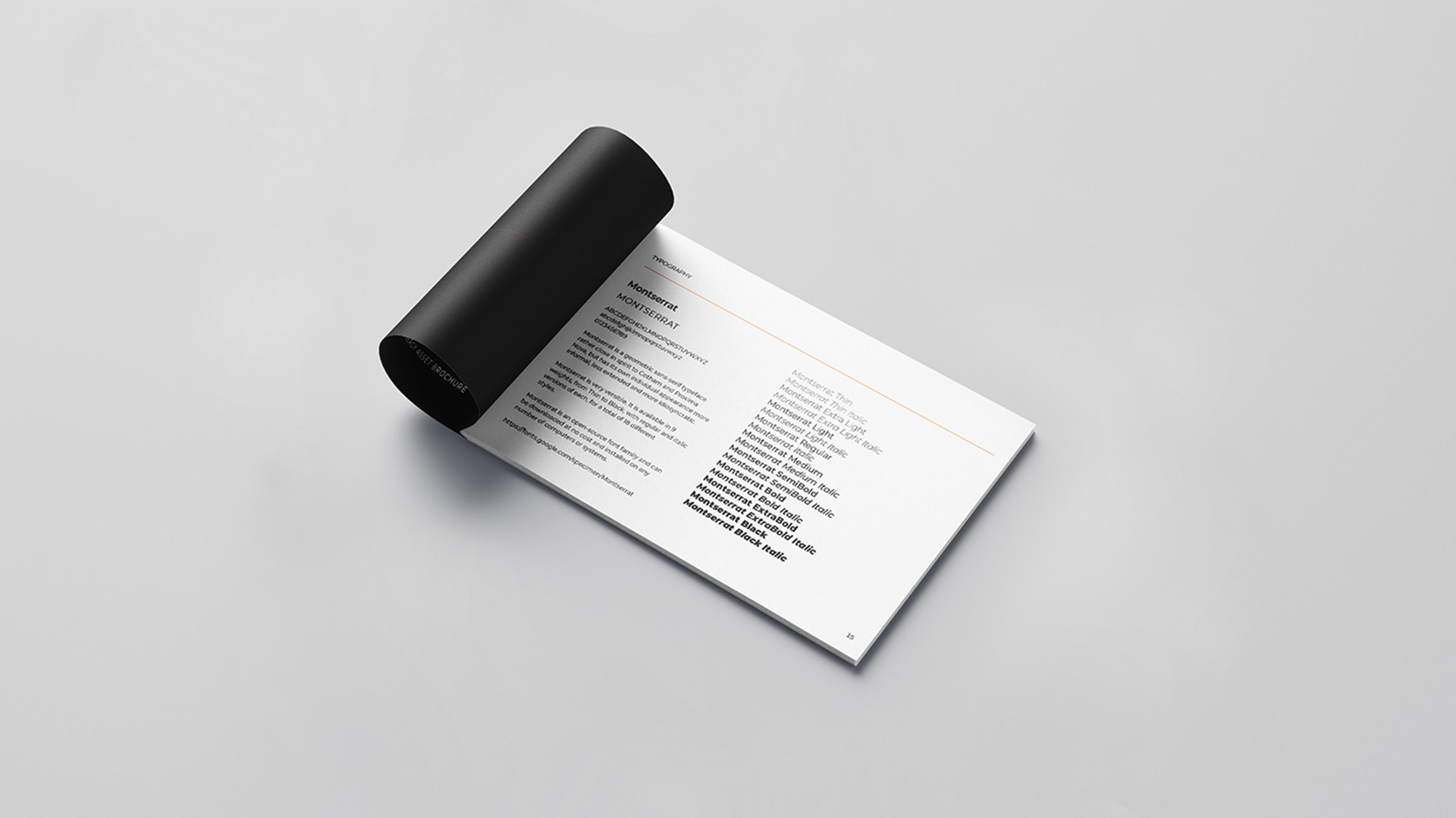
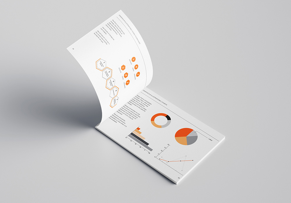
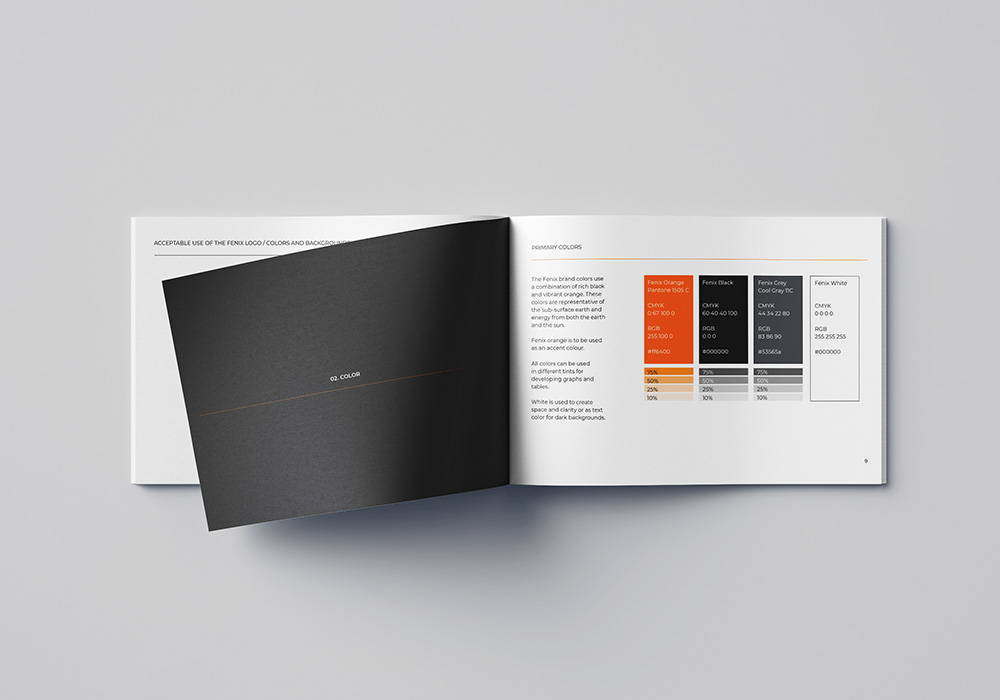
Brand applications
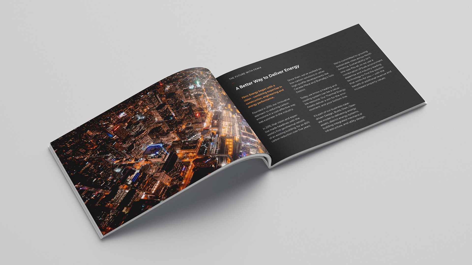
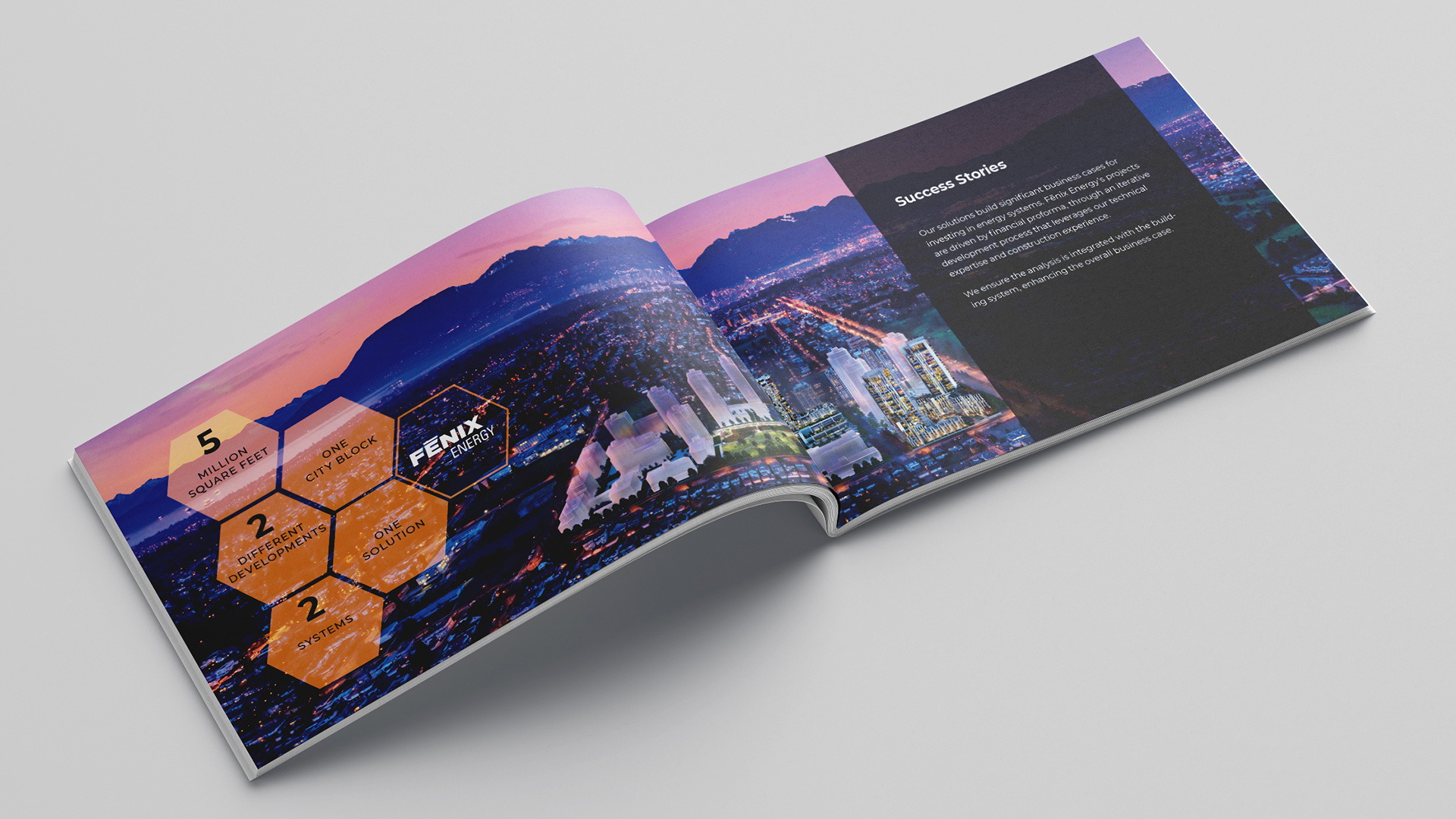
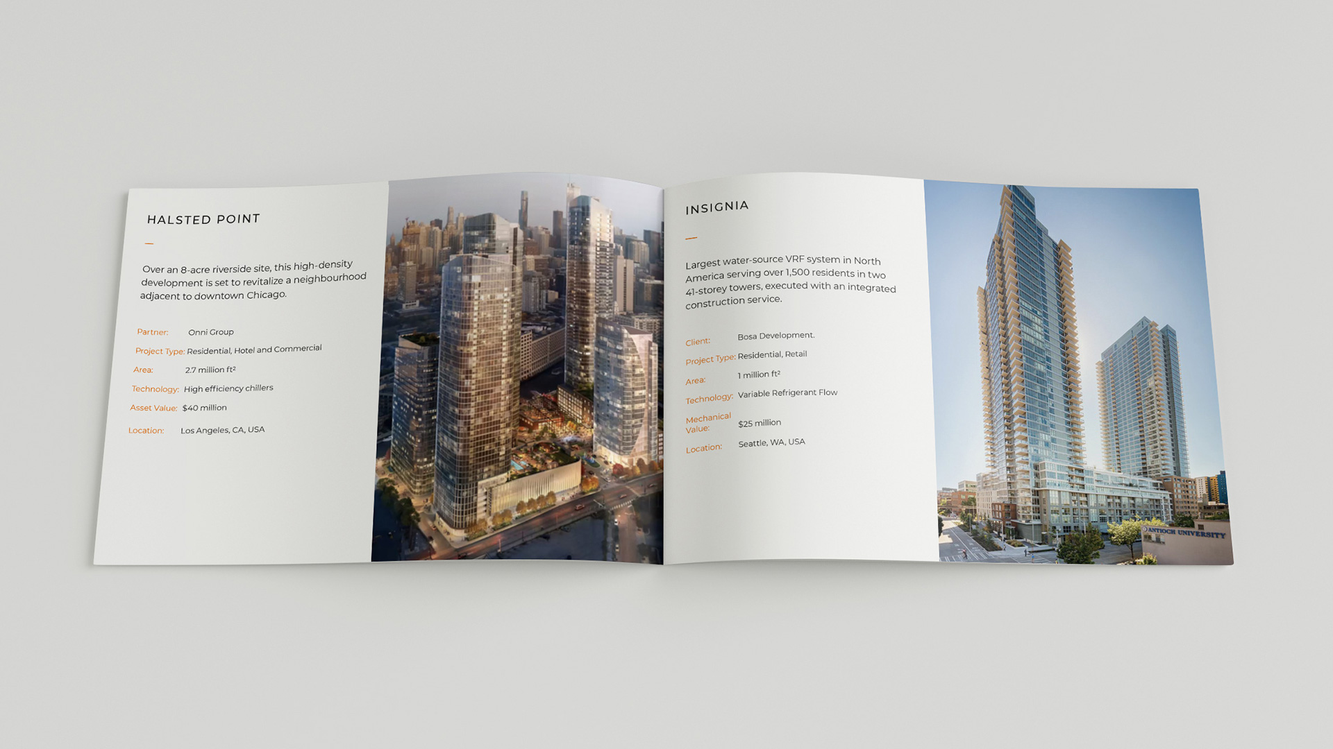
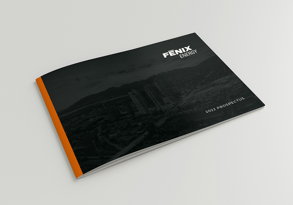
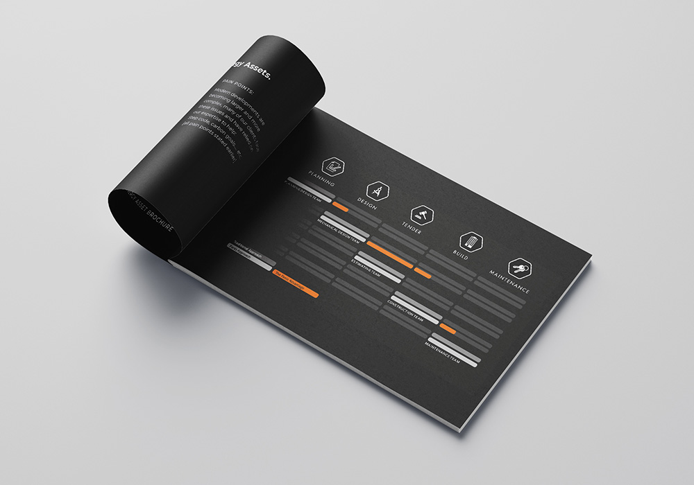
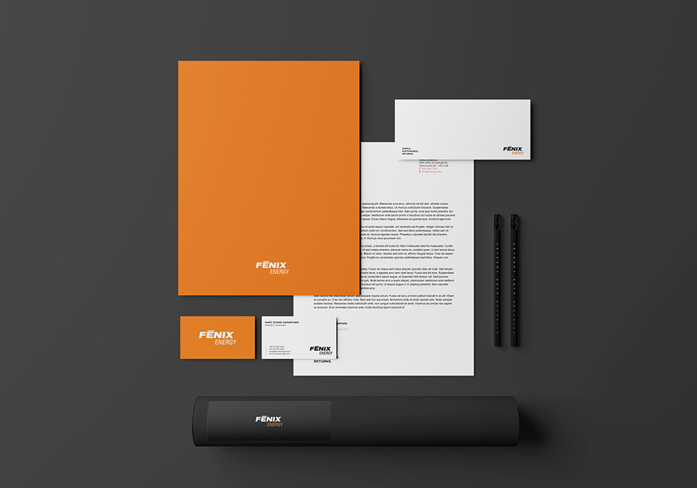
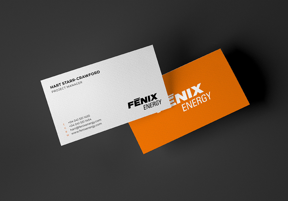
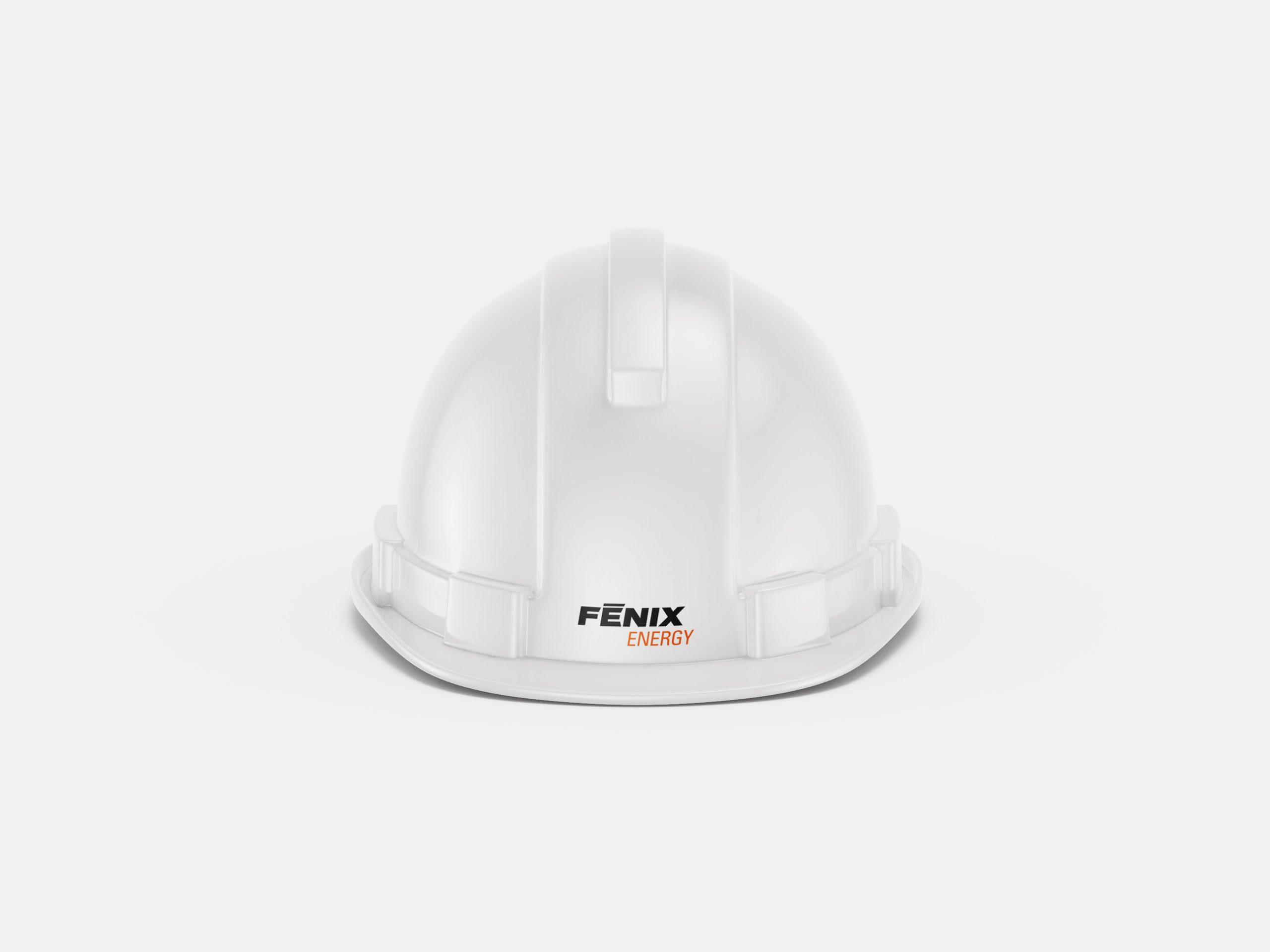
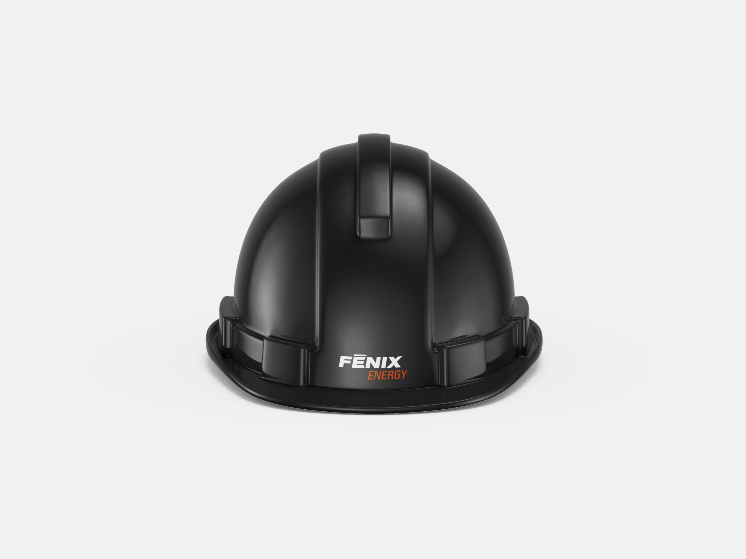
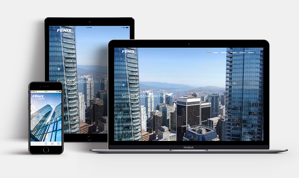
We applied the new brand styling across a number of other touchpoints including a bespoke icon set and Microsoft Office and InDesign proposal templates, brochure, proposal templates and website which is under ongoing development at time of writing.
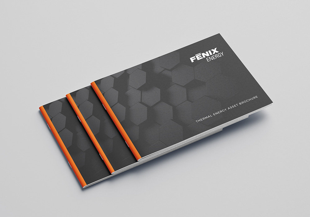
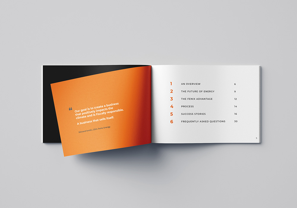
“We have worked with Stephen at Hologram on successful projects in the past, and appreciate his expertise and professionalism in everything he produces for us at Fenix. This project was challenging, it was urgent yet required patience. Hologram dealt with every aspect with great attention to detail.”
