Enersolv work with developers and architects to design, build and maintain high-performance, energy efficient buildings.
We were approached to help with a full rebrand, starting with a new logo.
Client
Enersolv Design + Build
Deliverables
Brand Identity
Graphic Design
Website Design
The new logo with its slight tilt denotes forward motion, a commitment to innovation and leadership.
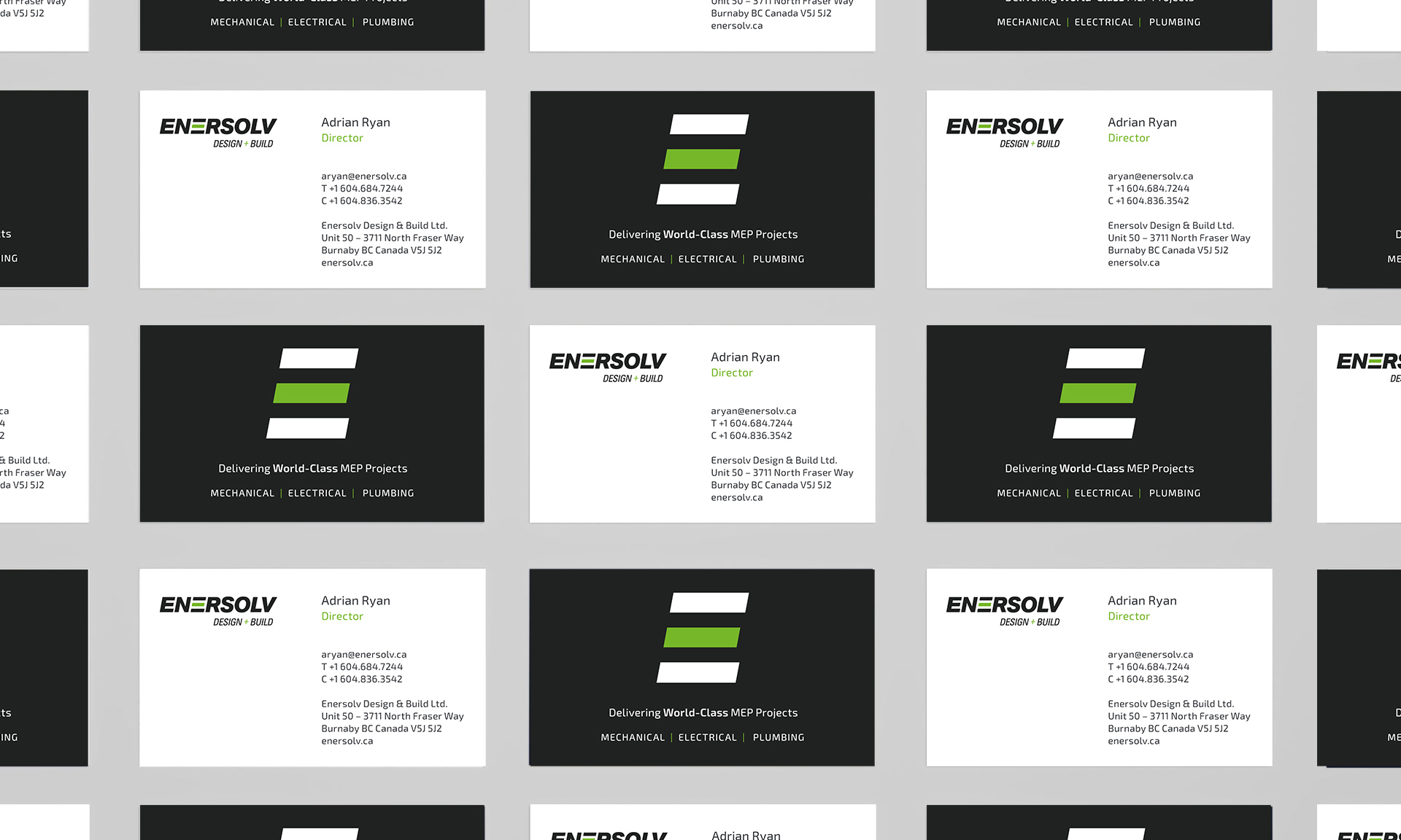
The Enersolv E can be used as a symbol when space is critical such as for social media profiles and on the back of hard hats, on labels etc.
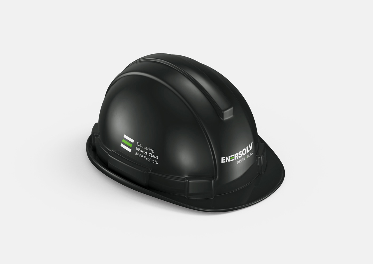
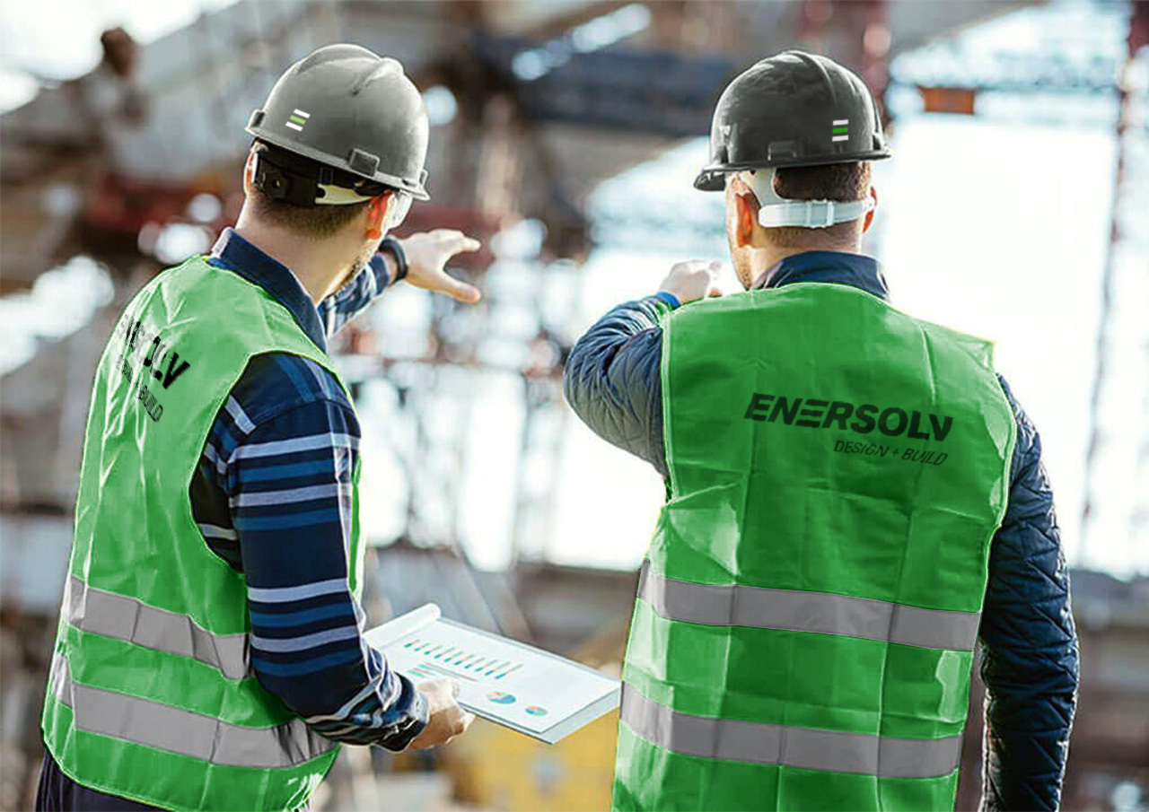
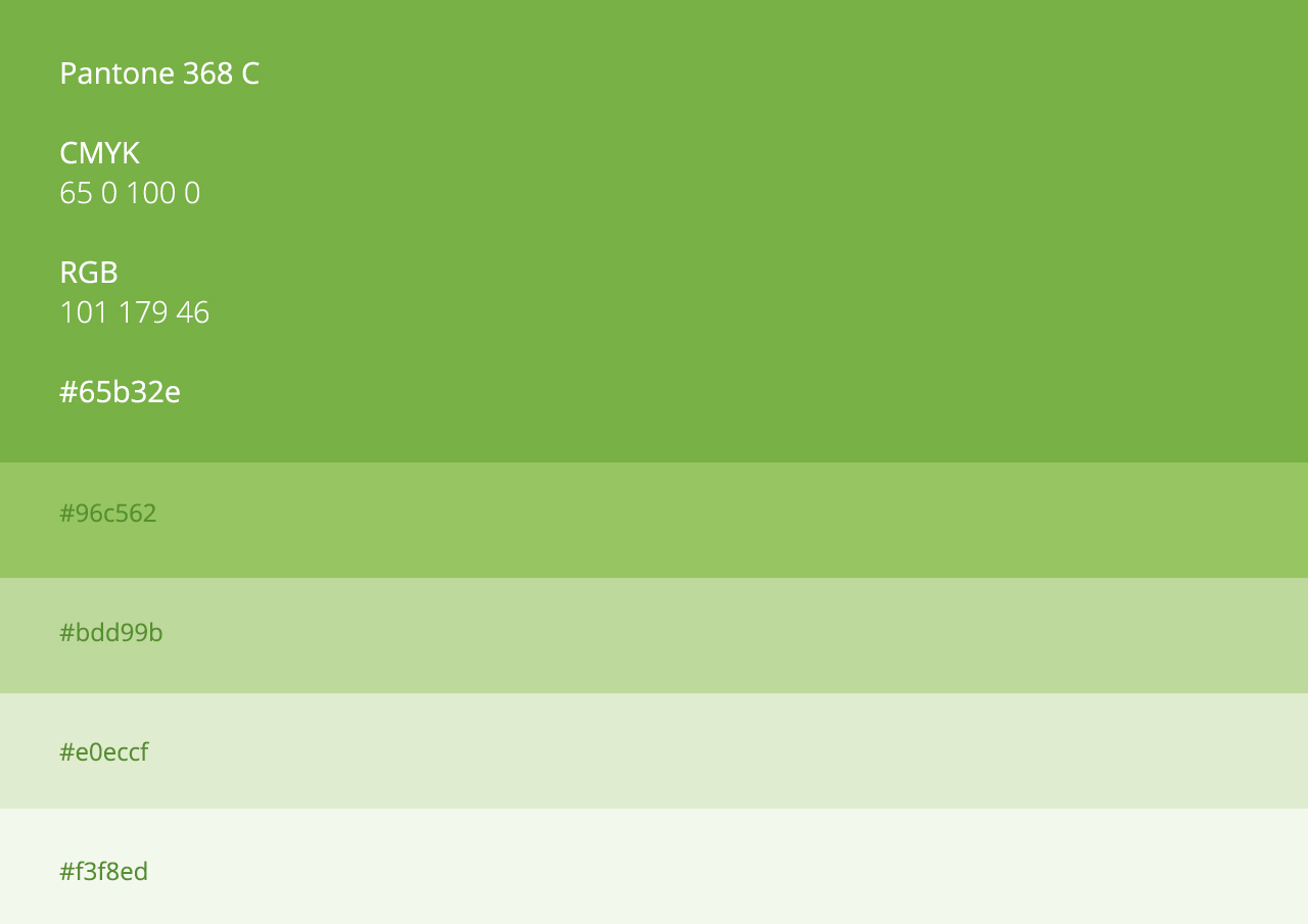
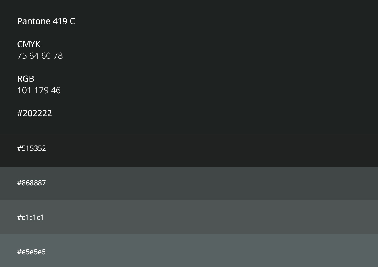
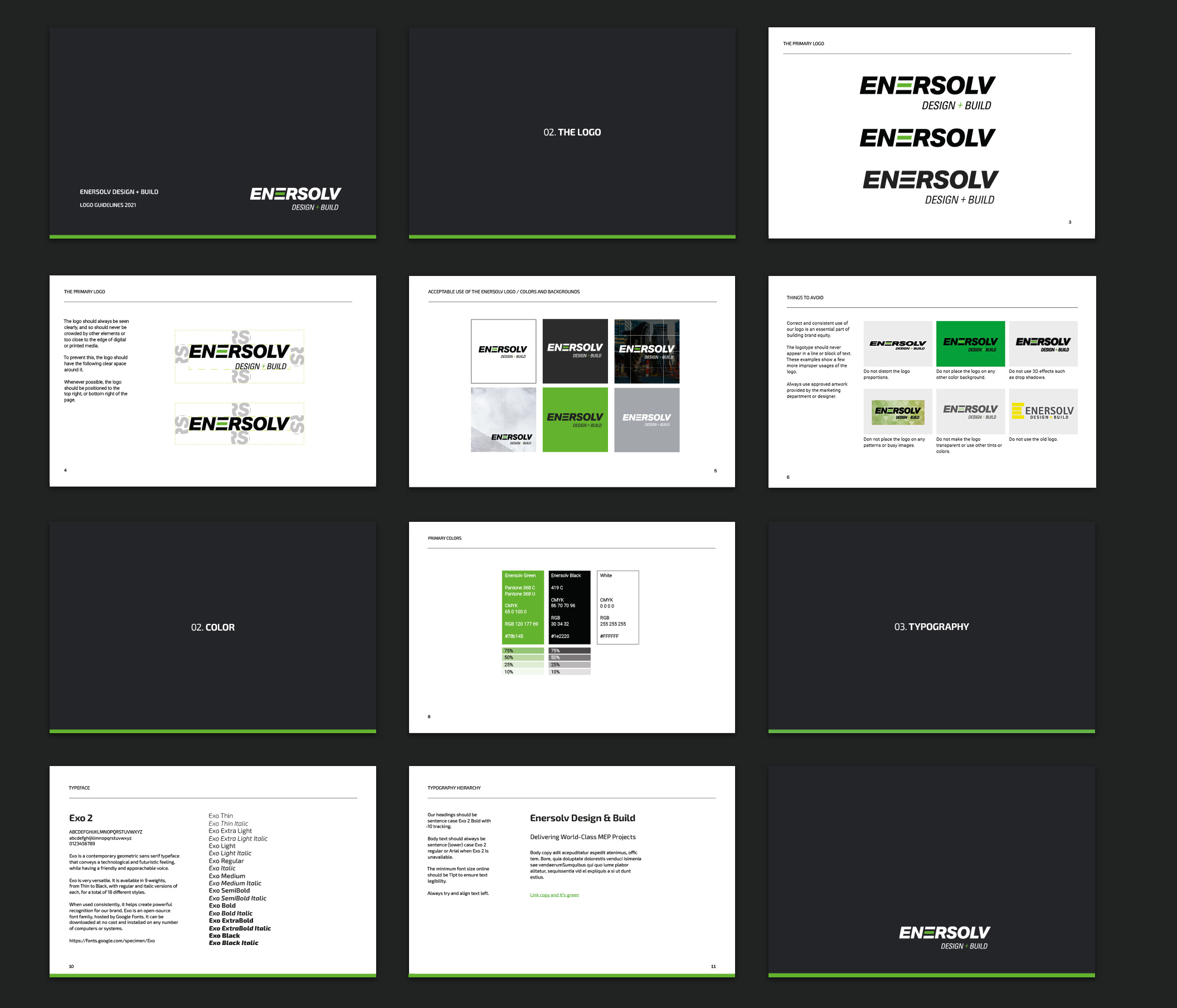
With the logo mainly being printed on white, such as on their white vans, we decided to move away from low contrast yellow and towards a more bold green with a darker, charcoal grey to accompany it.
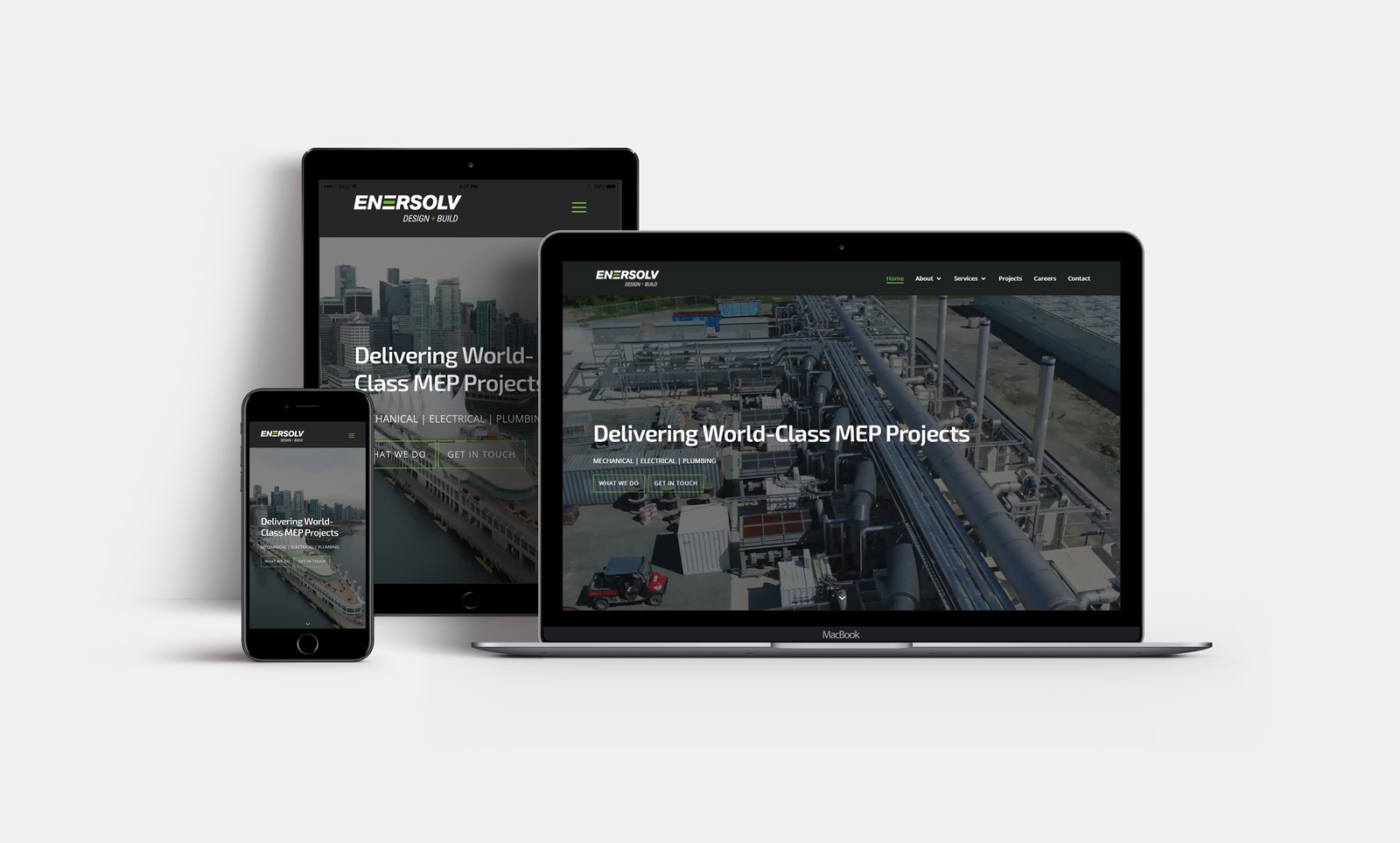
Enersolv’s website was very wordy, not mobile responsive and wasn’t set up with any SEO in mind. We created a clean, simple layout in keeping with the new branding and now have a mobile responsive website ready to be easily updated and developed further.
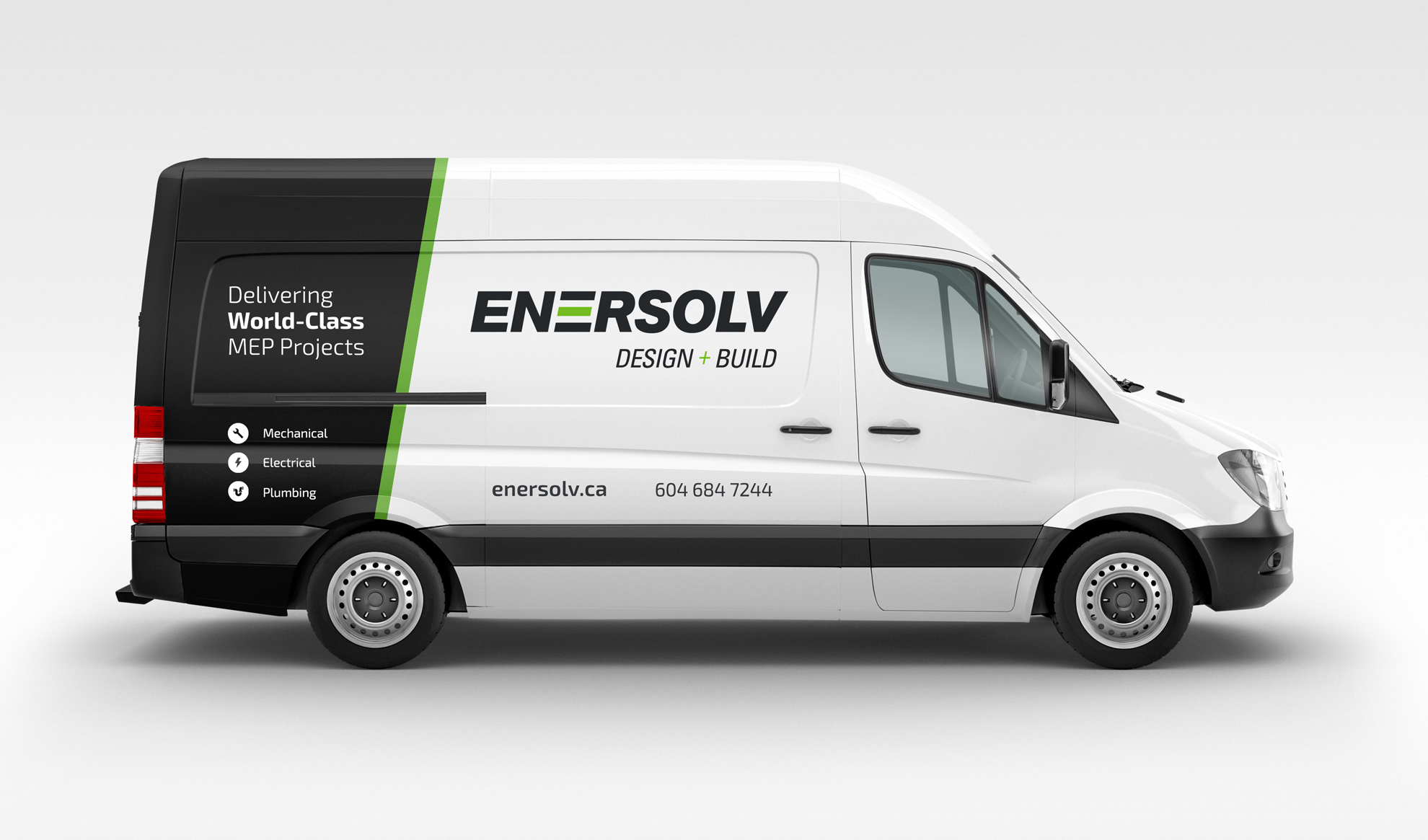
We applied the new brand across a number of other touchpoints including new van wrap designs, animated logo stinger for videos, bespoke icon set and Microsoft Office and InDesign proposal templates.
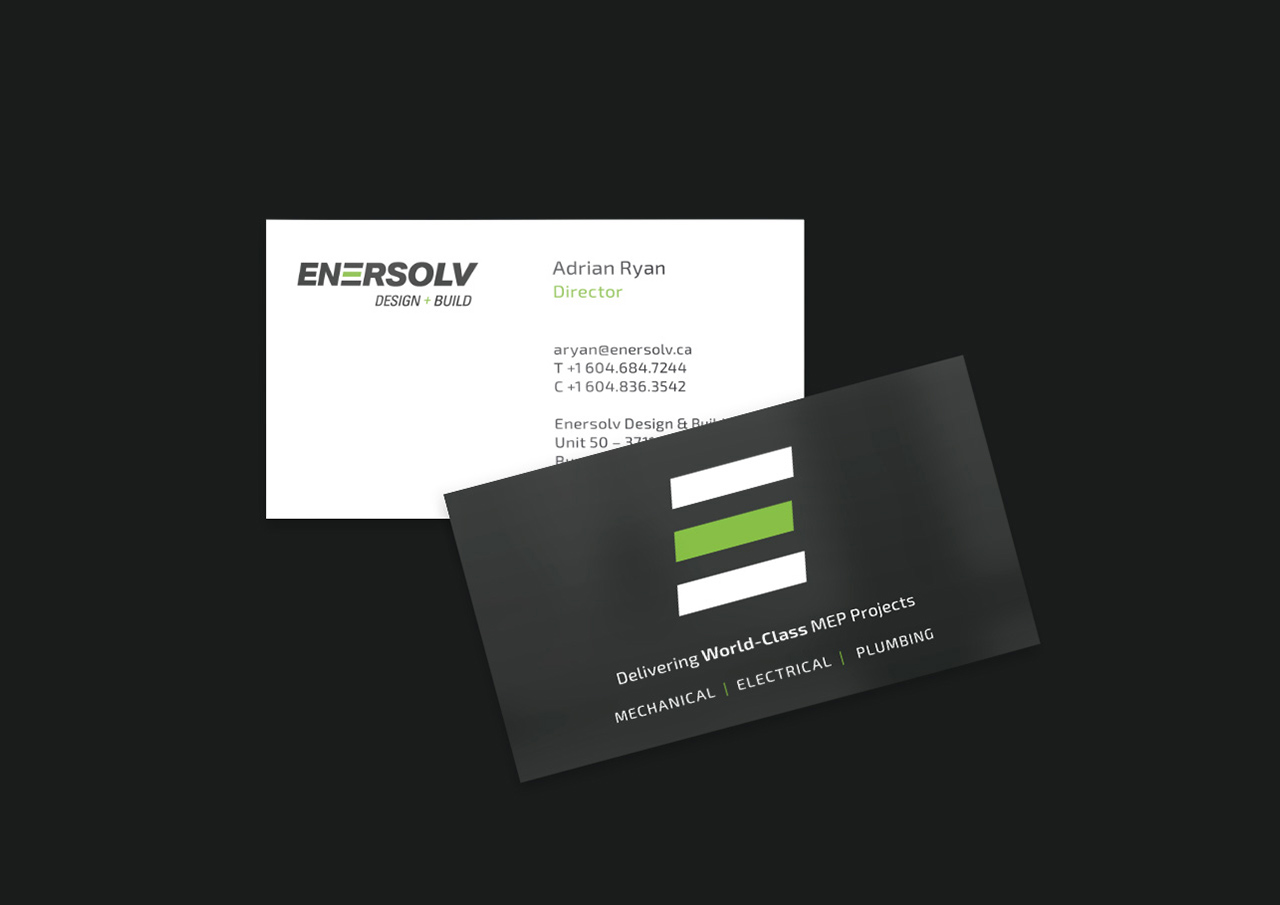
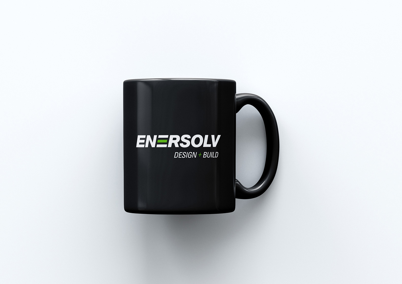

Inconsistencies with colour, font and even different logos in use is no longer a problem for Enersolv with their brand guidelines document helping them keep everything consistent.
“The feedback on the new logo and website has been really great. Everyone is delighted with the work you have done.”
